How to create a Bottom Navigation in ReactJS
Navigation is one of the most important things when designing a website or app, without a proper and accessible navigation users might get confused while using your app.
when it comes to mobile UI design there are different solutions for navigation, but one the most popular mobile navigations is Bottom Navigation Menu which is used in many famous apps like Instagram.
I recently needed to have a bottom navigation in the mobile view of a responsive reactjs app that I was developing, while there were a lot of Bottom Navigation libraries for react native, I didn’t find any good libraries for ReactJS so I decided to create my own Bottom Navigation Component and also share it with You!
so follow this post to learn about this new library and to have a bottom navigation menu in your react js apps:
Library GitHub Repo: https://github.com/hoseinhamzei/reactjs-bottom-navigation
Installation:
first of all we have to install the module so run this command in your project’s root:
npm install --save reactjs-bottom-navigationusage:
1- import the library and it’s required css, import the css in your project’s index.js file to make it available in the whole project:
import BottomNavigation from 'reactjs-bottom-navigation'
import 'reactjs-bottom-navigation/dist/index.css'
2- create an Array that contains the bottom navigation’s items, each item can have a title, icon, activeIcon and onClick property and all of them are optional, if you want your navigation to only have icons just don’t put a title in the item’s object.
you can pass any renderable element as icon and activeIcon, I did this to make the component as flexible as possible, in the below example I have used ant design icons which are font icons, you can use svgs or images or anything else as well:
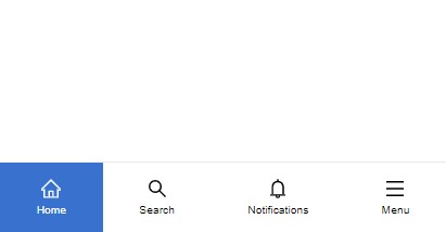
// items
  const bottomNavItems = [
    {
      title: 'Home',
      icon: <HomeOutlined style={{ fontSize: '18px' }} />,
      activeIcon: <HomeOutlined style={{ fontSize: '18px', color: '#fff' }} />
    },
    {
      title: 'Search',
      icon: <SearchOutlined style={{ fontSize: '18px' }} />,
      activeIcon: <SearchOutlined style={{ fontSize: '18px', color: '#fff' }} />
    },
    {
      title: 'Notifications',
      icon: <BellOutlined style={{ fontSize: '18px' }} />,
      activeIcon: <BellOutlined style={{ fontSize: '18px', color: '#fff' }} />
    },
    {
      title: 'Menu',
      icon: <MenuOutlined style={{ fontSize: '18px' }} />,
      activeIcon: <MenuOutlined style={{ fontSize: '18px', color: '#fff' }} />,
      onClick: () => alert('menu clicked')
    }
  ]
3- the component accepts the following props:
items: bottom navigation items array
defaultSelected: the default active item index
onItemClick: triggers when an item is clicked and it returns the item including it’s index
<div>
      <BottomNavigation
        items={bottomNavItems}
        defaultSelected={0}
        onItemClick={(item) => console.log(item)}
      />
</div>
Customization
the component elements have the following class names which you can assign new styles to them:
Bottom Navigation: bottom-nav
Items: bottom-nav-item
titles: bottom-nav-item–title